In 2010, YouTube had 800M active users + streamed 2B+ videos every day. But internally, we were flying by the seat of our pants and one burning question was on our minds:
How were people actually using YouTube?
This is the story of how one UX researcher ignited sweeping changes to the company’s approach to building the product.
YouTube 2009-2010
I joined YouTube in 2009 and still recall my first planning meeting with the search team. As we sat around a table, the product manager asked: “So what do you all think would be cool to build?”
In asking a few of my own questions, I realized the team was building without understanding how people were experiencing the product. We didn’t have the information to know what was working well or was challenging for users, so we couldn’t make informed choices about what features to prioritize across YouTube. To begin to understand this better, we started to grow the research team.
In 2010, we convinced Kerry Rodden (they, them), Google’s first Quantitative UX Researcher, to join YouTube. Kerry had started at Google in 2003 with a PhD in Computer Science from Cambridge and experience at Microsoft Research. At the time, Google believed in hiring smart, overqualified people who could jump in and do whatever needed to be done. Kerry was tasked with running usability studies to improve the UX of Google’s products. But they were especially interested in the intersection of data and user experience.
Kerry was the first person at Google to look at user data through the lens of what it revealed about a person’s experience with Google’s products. Over time, Kerry started applying a mixed quantitative and qualitative approach to improve products across Google like the Ad Words wizard, Blogger sign-up flow, and Gmail labels. Several of us had seen Kerry in action at Google and knew they could add tremendous value at YouTube with a similar approach.
The Key Question
To orient themself at YouTube, Kerry started asking PMs, Designers, Engineers, Execs, and other UX Researchers what their most pressing questions were. One question came up again and again: How were people actually using YouTube?
Kerry combed through the existing qualitative research and chose to focus on understanding how people navigated through the website. To do this, Kerry jumped into YouTube’s user logs. This hadn’t been easy at Google and it was similarly complex at YouTube.
Extracting data from the user logs required writing a script in a proprietary programming language, monitoring the script’s execution for hours through complex web pages, and hand-debugging any failures. This was all before understanding the data and filtering out irrelevant information.
Because Google was a search engine that linked people to other websites, the user logs only showed a tiny slice of a person’s experience — what happened before they linked offsite. A lot had to be inferred about their experience. e.g., If someone clicked off site and didn’t return, they had likely found what they were looking for. But if someone clicked off and came right back to Google, they likely hadn’t found what they wanted.
So Kerry was delighted to discover that, unlike Google, YouTube’s data showed a user’s entire session — revealing a user’s experience across all the pages they visited.* This also meant there was a lot of data. To simplify this data, Kerry categorized all the pages of YouTube into five page types: Home, Search, Watch, Channel, and Other (that included Account, Settings, etc.).
Initial Explorations: Chord Diagram
Kerry counted the number of visits for each different type of page. They then calculated, from each page, which page people were most likely to go to next. e.g. If a person was on the home page, what was the likelihood they would search vs watch a video?
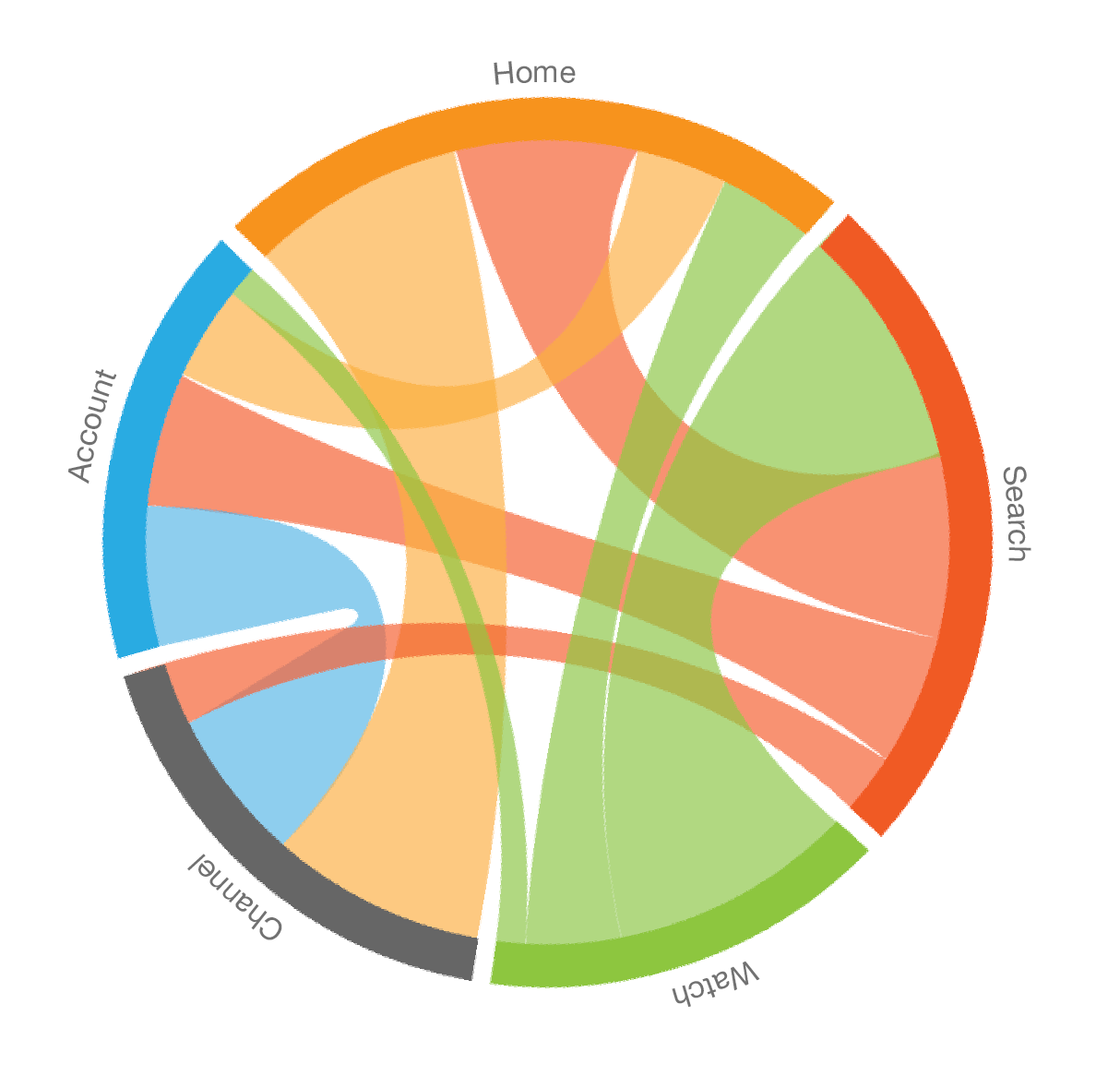
Kerry visualized this data as a chord diagram to show from any page, where people were most likely to go next. Below is an example of what Kerry’s visualization looked like, but it does not actually represent their findings.
These findings were eye-opening for everyone at YouTube. This was the first glimpse we had into how people experienced and navigated through the product. When sharing these initial findings with PMs, Designers, and Engineers, Kerry was met with excitement and a barrage of additional questions, like:
Where were people most likely to start?
Where did they go after this?
What did a typical session look like?
How/when/where did sessions end?
Refined Explorations: Full Sessions
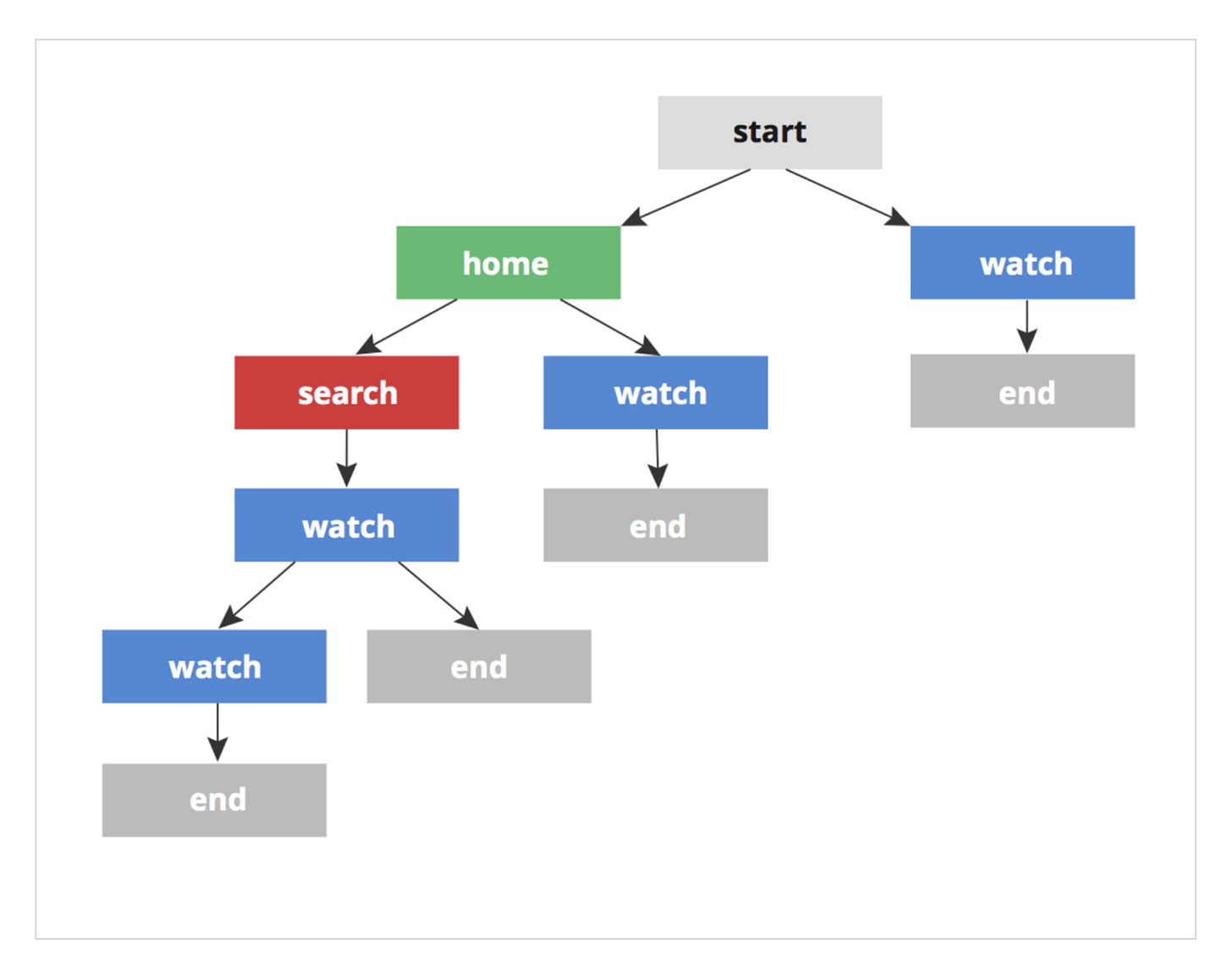
These questions led Kerry to analyze whole sessions. So instead of looking just from one page to the next, Kerry documented where people started, and from each page, where they went next — across their entire visit or session.
As they went deeper on calculating full sessions, they explored several different ways to visualize the data. The explorations below started to paint a clearer picture of how people moved through YouTube.
Final Visualization: Sunburst
Kerry had started to make sense of the data. But the linear format of the above explorations still made it hard to see patterns or extract useful information. Anyone looking at the data still had to do a lot of work to find meaning. Kerry’s goal was to show the data in a way that everyone inside of YouTube could easily understand and apply to help improve the product. So they kept exploring how to visualize this.
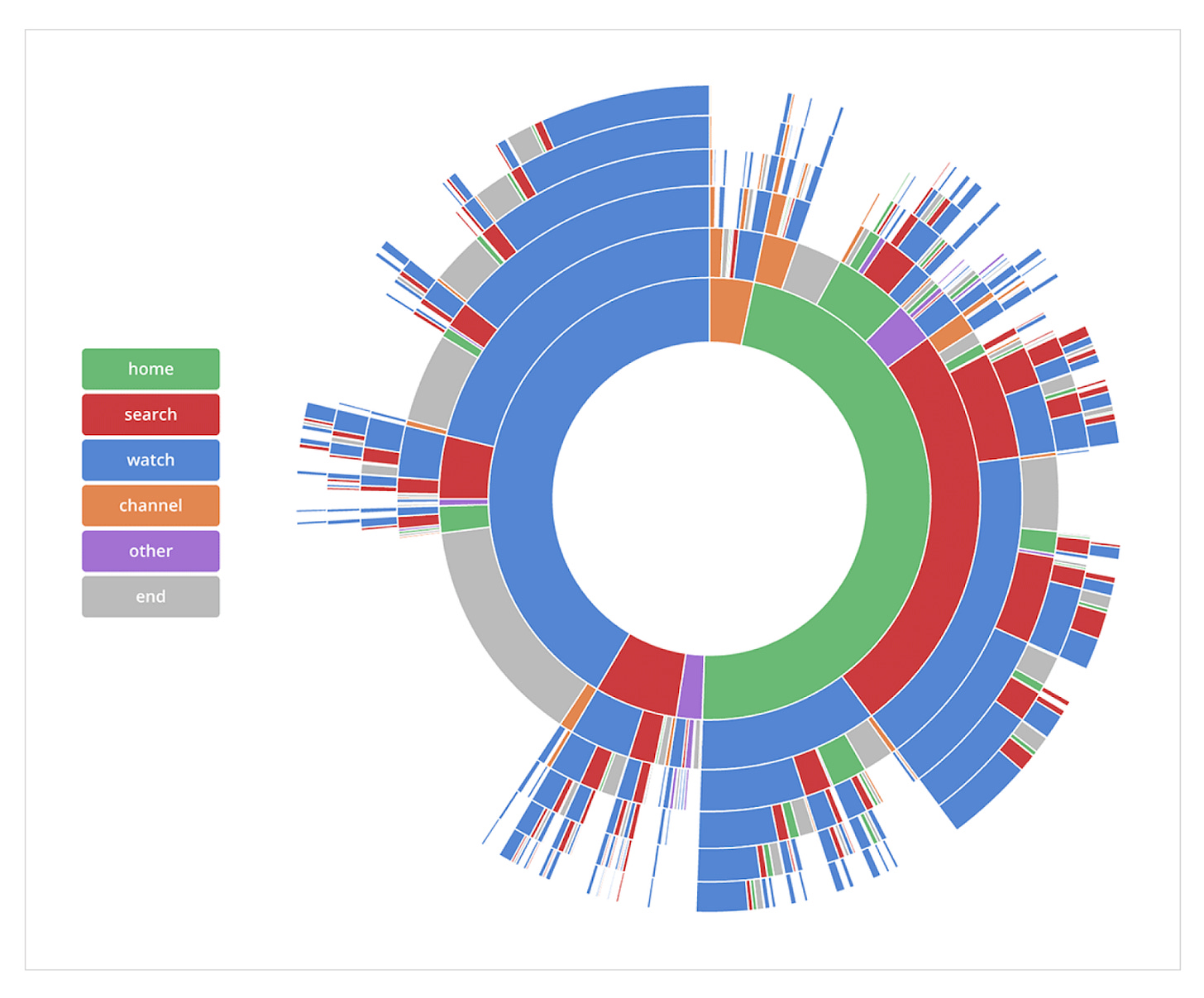
Ultimately, Kerry landed on a radial sunburst format to visualize the data. In this view, it was easy to see the relative % of sessions that started with each page type, and to follow a user’s path across an entire session. This visualization illustrated the sequences of how people navigated YouTube, starting from the inside and progressing to the outermost ring:
Again, Kerry sought “user” feedback and shared this with their peers across YouTube. From these conversations, Kerry iterated on the visualization, adding interactive elements like visual highlights, explicit percentages, and breadcrumb navigation to make it extremely clear what people were looking at.
Kerry built an interactive version that allowed people to hover and trace any path from start to end, with the percentage of sessions that followed that exact path. You can explore this format yourself at: https://observablehq.com/@kerryrodden/sequences-sunburst.
Kerry’s visualization went viral inside of YouTube. It was turned into posters and hung up on walls, printed onto t-shirts, referenced in Executive strategy decks, and featured in orientation for new hires. A key piece in the mystery of how people used YouTube had been unlocked and now everyone held the keys.
What Kerry Discovered
We had all assumed YouTube’s homepage was important. In 2010, the homepage had 45M+ visits per day. Other companies were clamoring to buy enormous ads on the home page, like this Minions example from Illumination Entertainment:
But Kerry’s research revealed less than half of YouTube sessions started on the homepage. The majority of user sessions started directly on the watch page — via links people stumbled upon around the Internet.
Of sessions that did start on the homepage, people primarily came to search. There were tons of videos featured on the homepage, but these were most often bypassed. People came to YouTube with an intention, like “how to tie a tie” or “funny cat videos.”
The Impact on YouTube
In 2010, most YouTube sessions began with an initial video or a search term. Strategically, YouTube wanted to require less user effort. It wanted to be more like TV and line up interesting, engaging, relevant videos for people to watch. Kerry’s work fed into this larger company shift to making YouTube a destination for discovering videos.
At the time, YouTube’s homepage showcased a bunch of popular and trending videos that were driven by a mass algorithm. But these videos weren’t of interest to most people. To make the homepage compelling, it needed to showcase content that was interesting to each person. YouTube invested heavily in personalization. This helped transform the homepage into a destination for discovering interesting, relevant video content.**
The transition to personalized content was especially pivotal later, as people shifted from desktop to mobile. Personalized recommendations helped YouTube become the dominant mobile video app. Today, we open the YouTube app and start watching videos without even thinking — it just works.
Kerry’s work was so well received inside of YouTube, that YouTube TV and Google TV applied a similar technique to shaping their products. Kerry open sourced the code for the sequences diagram, which you can find at https://gist.github.com/kerryrodden/7090426.
—
Final Thoughts
Kerry’s visualization was an inflection point in YouTube’s history. YouTube had been operating like the Wild West and had been crazy successful in doing so. But Kerry’s relentless pursuit of both understanding and visualizing the data, revealed to everyone at YouTube exactly how people used the product.
Their method and findings created lasting ripple effects that elevated how well we understood users’ experiences, how we approached building products, and how so many subsequent video-first companies shaped their products.
Kerry’s work highlights why it is so important to have a clear picture of how people experience your product — both qualitatively and quantitatively. Understanding this fuller picture can open your eyes to issues, to unexpected behaviors, and can help you perfect the parts of your product where the magic happens.
Important Notes:
* User sessions were completely anonymized, so no session data was attached to an identifiable person. All of usage data was separated from the video content, so we were able to track the page types e.g., watch page or search results page, but not the actual videos or search queries.
** As a team, we were idealistic about personalized content. If one person liked to watch funny cat videos and another person liked to watch documentaries on European history, it seemed like a great idea to showcase this type of content to each person. We naively didn’t consider the potential negative ramifications, like sucking people into conspiracy theories or contributing to political divisiveness.
I posted a shorter version of this story on X a while back and got some questions, many of which I aimed to answer in this full version.
Feel free to email me with any additional questions you have. I’d love to hear from you and will try to get back to every reply!


GO GO KERRY!