Make YouTube Better.
How YouTube’s first UX designer sparked a major shift in the product experience.
I recently met up with YouTube’s first UX designer, C. Form Miller. It puts a smile on my face just to think about our conversation. Form exudes this incredible energy and contagious excitement. It had been more than a decade since I had talked with Form and I wanted to hear more about his early days at YouTube and how his thinking and design work had shaped the product. We covered a lot of ground. But one simple story really stood out to me.
On Form’s first day at YouTube in Jan 2006, Chad Hurley simply told him to: "Make YouTube better."
Many designers might finesse the visuals, propose a new feature, or do a full redesign. But Form took a scrappier approach.
He found 10 YouTube users, rode his motorcycle to their houses and dorm rooms, observed them using the product, and asked several questions about their experiences with the product.
From those interactions, he identified what worked and what didn’t, and summarized them into a list of improvements to “make YouTube better.”
This list became the product roadmap for the next 18 months.
Lesson: UX research can be simple, scrappy, and have profound impact.
When Form joined YouTube in Jan 2006, YouTube was just a start-up. There were <20 employees, no research team, and no resources for doing research. So Form scrappily went out and found users, observed them, and talked with them directly.
One of his key discoveries was that people found the video watch page too cluttered.
It’s natural for products to accumulate features and become more complex over time. Tech teams are much better at adding new features than removing old ones. So as time goes on, products end up with more features, more complexity, and more clutter.
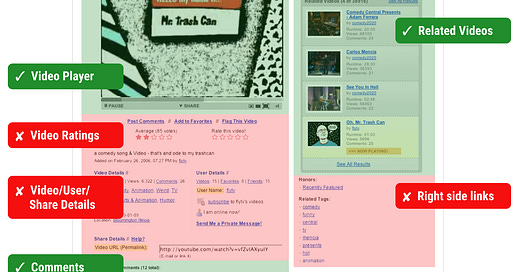
But in YouTube’s case, Form intervened. By observing real people use the product, he was able to determine which features:
Were valuable and should be doubled down on (video player controls, related videos, comments)
Were low value + made the product more complex, so should be removed (previous/next, video + user details, tags, honors, etc.)
Form handed me a copy of the findings from his original user research in 2006. 🤯 These were incredible to pour over. Below are some of his findings from the video watch page in more detail:
Features that were working well, but could be improved:
Video Toolbar
Everyone used the ‘Play/Pause’ button.
Nearly everyone found “auto-play” annoying.
Some users requested a better way to time-shift. The “size” icons were regularly misunderstood. Many users wanted to see the runtime and elapsed time.
Comments
Almost everyone read a video’s comments after watching it.
People liked comments, but found many of them pointless, immature, or inappropriate. They wanted a way to rate comments or at least for the good comments to bubble to the top.
Most users did not post their own comments.
Related Videos
This component was hit-or-miss for nearly everyone.
Most people looked at the related videos section to find other videos to watch.
But frequently, they found the “related” videos were not related at all, which caused frustration.
Note: There seems to be a great opportunity with this component, but it needs to consistently be of value to the user to be worthwhile.
Low value features that made the product more complex, and should be removed:
Ratings
Only a few users rated videos themselves.
Several users said they did not see the video links (add to favorites, flag video) because “there were so many blue links on the page, the links got visually lost.”
Video/User/Share Details
Most users skipped this area entirely (to scroll down to the comments) and called it “jumbled” and “cluttered.”
When sharing, most users copied the URL and sent their own email.
Previous/Next
Most users did not use this component, and were unsure what it was paginating thru.
However, many users requested a “history” of their watched videos.
Right-side Links
People rarely used these links (honors, related tags, playlists) and did not understand them.
Most people were confused between a video’s tags and its related tags. Too often the ‘related tags’ were not related at all, and were meaningless or insignificant.
Eventually, most of Form’s findings were addressed. The low value features were easy to remove or bury.
But many of they key product improvements took years to address. Whole teams were spun up to address refining the video player, honing the related videos algorithm, and making comments a positive and useful experience.
Had Form taken a different approach to “making YouTube better,” YouTube may look very different today. But instead, he started by observing and talking to people who used YouTube, learning from their experiences, and charting a path to make YouTube better.
So when you aren’t sure how to proceed…just go observe and talk to people!
Note: Form’s original research findings covered all the core pages of YouTube’s product experience (including the home page, videos page, search, channels, groups, watch, etc.) For simplicity (and because it captured the core value of his work), I only focused on the video watch page.
With his permission, I summarized his findings in a simplified way that makes sense in today’s context (18 years later). But here are the video watch page findings from his original report:


love Form