


The pixels that made YouTube
How YouTube solved a major strategic hurdle — with a small design change

In 2006, YouTube was facing a strategic crisis: Despite explosive growth, YouTube was virtually invisible.
The majority of video views came from YouTube videos embedded on other sites like MySpace. While these sites provided massive reach, most viewers weren’t aware they were watching YouTube videos.
YouTube couldn’t just watermark the videos since they didn’t own the content. So the key question became: How could YouTube make its brand recognizable on videos across the internet without claiming ownership of the videos?
Big, strategic problems often attract big, complex solutions. But in this case, YouTube’s answer came from a simple, tactical design solution.
—
Starting Point
While YouTube was seeing great success, co-founder Chad Hurley wanted to uplevel its visual design and polish. So in mid-2006 he hired Ches Wajda to help define YouTube’s visual brand and weave it into the product.
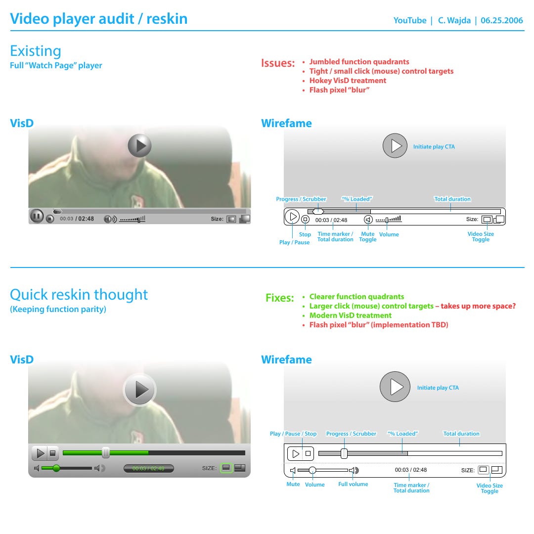
For Ches’ first project, Chad asked him to improve YouTube's video player. At the time, YouTube was using a generic, open-source video player with cluttered, tiny controls that looked like this:

As Ches explored the different components of the video player, he saw lots of ways to improve its functionality and aesthetics. But he also saw the opportunity to solve YouTube's branding problem.
YouTube didn’t own the video content, so they couldn’t watermark videos. But YouTube did own the video player, so they could design a branded video player that was unmistakably YouTube.
Small changes, big impact
Ches got to work refining the player UI — grouping controls by functionality and simplifying the interactions. But visual design was what really pushed the branding needle. At the time, most video players had a standard look and feel with blue accents.
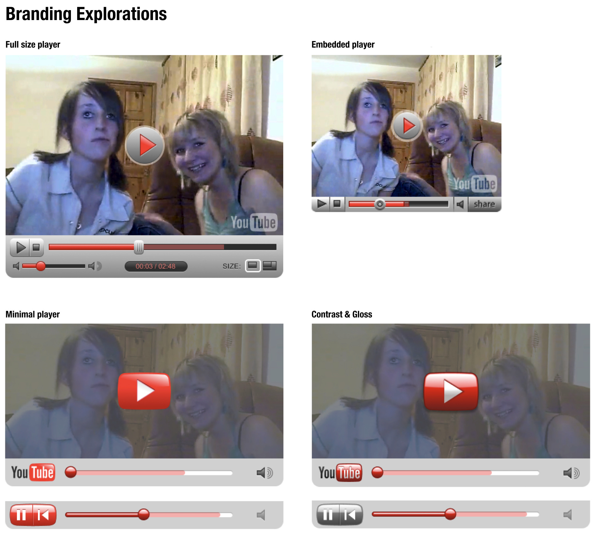
Ches took some bold visual leaps and brought “YouTube” aesthetics into the player. He:
Replaced the industry-standard blue with YouTube's signature red
Softened the shape of the player to echo YouTube's logo design, including rounded corners and a circular scrubber
Transformed the central play button into a version of YouTube's TV-shaped icon
Individually, these were subtle changes. But together, they transformed the player into something distinctive. By branding the player, YouTube wasn’t claiming ownership over the video content. But it was creating a signature look and feel around each video that was unmistakably YouTube.
What made it work
Some of Ches’ explorations heavily pushed YouTube’s brand into the player, but the final design leaned on subtle visual cues. While the branding felt distinctive, it didn’t compete for attention or disrupt the viewing experience.
Given YouTube’s multiple audiences, it was important the player worked for casual viewers, creators, and major media partners. Whether someone was watching on youtube.com, MySpace, or another website, the player quietly and consistently communicated this was a YouTube video.

The big lesson
YouTube’s solution to this big, strategic crisis didn't come from complex strategy meetings or expensive marketing campaigns. Instead, it came from a creative insight combined with small, tactical changes that had an extraordinarily outsized impact.
Those initial, subtle design choices proved remarkably resilient. Even as the player evolved over time, the foundational visual nods to the brand persisted — weaving themselves into YouTube's core identity and cementing its iconic status.

Bonus Materials ✨
Because the design nerd in me loves seeing historical design content, I thought some of you might like it too. Below are Ches’ original designs from 2006 (shared with his permission):
Intitial Analysis
First “YouTube-branded” versions

Explorations of a more minimal player + dialing up the YouTube branding

The final designs

Asset Exploration

v.7 is the FINAL! I love that this still happens to this day!
Hey, I’m the guy dancing in that screenshot from 2006. Thanks for the nod.