Google Maps UX: The India Conundrum
How Google Maps first failed and then creatively adapted to flourish in India.
When Google Maps expanded to India in 2008, it made a major blunder. Here’s how we quickly recovered from our mistake and creatively adapted Google Maps to work in India.
At the time, Google Maps was built on the foundation of street names and address numbers. The product worked by inputting known locations and providing turn-by-turn directions between those locations.
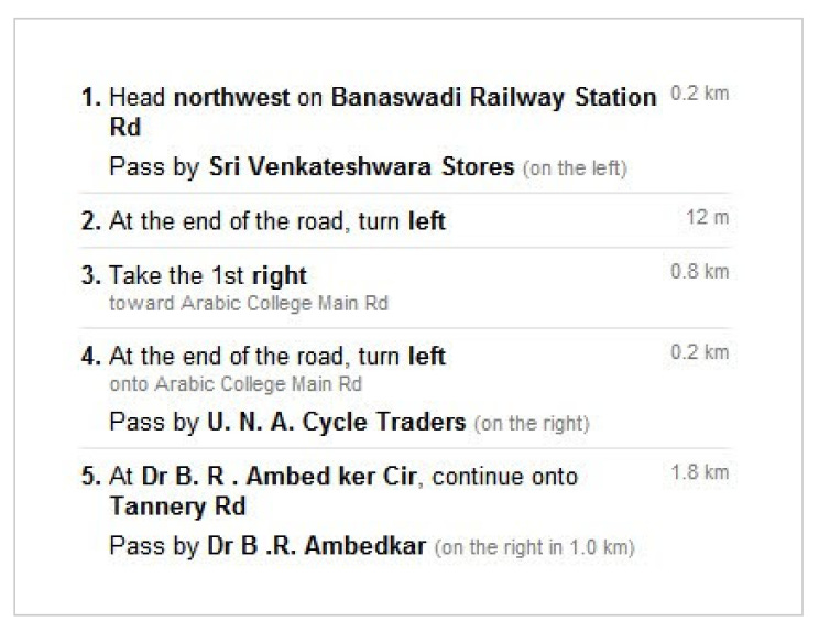
But in 2008, when Google Maps launched in India, nobody used street names. So directions looked like this:
This was before real time, accurate GPS in phones had become mainstream. So unless you carried a compass and could accurately measure distance as you traveled, Google Maps’ directions were pretty much useless in India.
Localizing
Launching a product in a new region is only meaningful if it’s useful to locals. In this case, the challenge wasn’t acquiring and cataloging local street names. Many streets either didn’t have names, had multiple names, or weren’t known by their official names. And regardless, people didn’t use street names to navigate.
We could have left the product as it was. We could have assumed it was good enough, would get better over time, or that eventually people would adapt. But India was a massive potential market and we all wanted the product to thrive. So we had to find a different way around this problem.
We already knew that many communities around the world relied on landmarks (rather than street names) for navigating. e.g. “Turn left at the park, head towards the water.” We knew that people in India also used landmarks to navigate. But we had to confirm that landmark-based digital navigation could work in India. And if it did, how we could make it work within Google Maps.
Getting scrappy
So the team started to explore how Google Maps could work if it incorporated landmarks. But we needed to understand 2 key questions:
How did people use landmarks to navigate in India?
What types of landmarks were good navigational aides?
This is where user research came in. At the time, Google had robust support for user research. There were many UX researchers on staff. There were dedicated research labs on campus with sophisticated eye tracking technology and one-way mirrors for observing participants. There was a team dedicated to maintaining lab equipment and another for recruiting research participants. Usability studies were a standard part of developing and launching products.
But in this case, the UX researcher on the project, Olga Khroustaleva, disregarded Google’s fancy lab set ups. Instead, she focused on how she could best answer these questions. She had a background in ethnographic research and knew a lab study wasn’t going to get her the answers she needed. So she put together a creative, scrappy research plan, grabbed her design partner, Janet Cheung, and boarded a plane to India.
What followed was nimble, on the ground field research to understand, first-hand, how people used landmarks to navigate in India. Olga and Janet creatively tried several different tactics to understand how locals navigated their way through India, including:
Calling businesses and asking them for directions to their stores
Asking people to draw diagrams of routes to familiar places
Following people around as they navigated unfamiliar places
Recruiting people to keep track of directions they gave or received + later interviewing them on their experiences
Sharing early designs of landmark based directions and asking for feedback
Landmarks in use
Through their conversations and observations, they found that people used landmarks to navigate in a few key ways:
• Orientation: “Head towards the water”
• Description of a turn: “Turn just past the Big Bazaar”
• Confirmation of the right path: “You'll see a petrol station on the right”
• Error correction: “If you get to the roundabout, you've gone too far”
Landmarks that were helpful for navigating included parks, monuments, shopping centers, notable buildings, stores, petrol stations, roundabouts, etc — basically anything that anyone would notice while on the road.
So the team reworked turn-by-turn street directions to include navigational landmarks to help orient people, signal turns, confirm direction, and error correct. The team worked through several iterations before finally landing on a solution that emphasized landmarks, but also subtly included road names (when available):
Legacy
The story of Google Maps could have looked very different in India. Olga’s and Janet’s scrappy ethnographic research drove the product changes that helped transform Google Maps into the dominant navigational product for India.
A lot has changed in the last 15 years with the pervasiveness of location-enabled mobile phones, cheap mobile data, and generally how locals navigate in India. But the use of landmarks to help people navigate digitally through India has stood the test of time.


So, conclusion is that we have to know ground realities and user insights before launch a product.. right?
Wow, glad I came across this post!
I contribute to Google Maps whenever I can, in my local language. It’s rewarding to see the views my contributions get when I receive email alerts from Google Maps.
There was a meme teasing Google Maps for directing people to a river or canal, but that meme isn’t as popular these days. Maps has improved a lot, especially in small towns, and now even has street view!