


Just ask for the whole salami

Too often, I see UX flows that progressively ask for a bit of information at a time. Years ago, a former colleague introduced me to the German term “salamitaktik,” which roughly translates to asking for a whole salami one slice at a time.
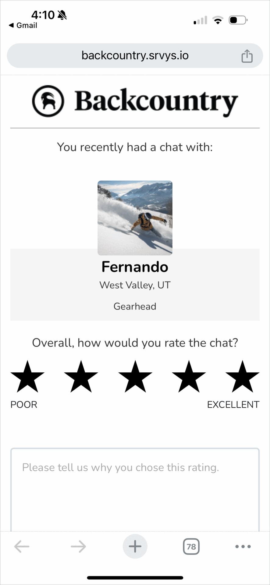
I thought about this term recently when I came across an endless feedback UX. The feedback UX appeared quick and simple, but each interaction revealed yet another request for more information.
What’s bad about this?
Backcountry’s rating UX is wild because it:
Is way out of proportion with the time invested in a brief interaction with customer service rep.
Skews to those who had an extreme experience (really good or really terrible).
Gives no indication of % completion. It starts off innocently asking for a quick star-rating and then just keeps going…
What does a good rating design look like?
Uber’s rating UI is a classic five-star experience. After you’ve gotten a ride, you can rate your driver 1-5 stars. Done. That’s the whole salami.
(For now, let’s set aside the psychological complexity of star ratings for gig workers.)

A smart, streamlined rating flow follows these principles:
Do: Be cognizant that you are asking people for their time.
Do: Prioritize the most important feedback up front.
Do: Keep it short — remove anything that isn’t necessary.
Do: Let people opt-in to share more details — especially relevant for really positive or negative ratings.
Do: Let people know what to expect and know where they are in any flow.
Do: Let people leave at any time.
Don’t: Salami Slice!
Remember: this is a touch-point with your company/product, so this also leaves an impression.
Let’s apply these lessons to Backcountry:
Backcountry asks eight tedious questions:

But fundamentally, there are just two key questions:
Was the person’s issue resolved?
How well did the customer service rep perform?
If Backcountry were to ask just these two questions, they would understand if they needed to follow up with a customer (whose issue wasn’t resolved), and they would have a sense of each customer service agent’s performance. Plus, the person completing the form would feel a sense of accomplishment.
Something as simple as this could work:

I realize that Backcountry’s feedback UX is powered by Medallia. But this is a great example of where good design is less. Put in the work to figure out what information you really want to collect and keep things simple and streamlined.
If you have come across any particularly good or bad feedback UIs, I’d love to hear about them!
When I was at , they did this with their NPS questions / surveys. They give you 2 or 3 questions THEN ask if you would like to answer more. I love the idea of let me get this done and out the way. Single page. Done. Great post!
Don't slice the salami!